For my CSC104: Beginning Website Interfaces course as a student at UAT, we were asked to conduct research and evaluate two sites for appeal based on their web design and user experience. In our post, we were required to document three reasons why we found our chosen sites appealing or unappealing. Here are my insights for this activity:
Appealing Site 1: Pinterest
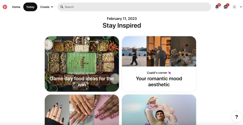
Pinterest is a visual heavy site that curates content in a feed from a variety of topics tailored to the user’s unique interests, behavior or specific searches.
Web and User Experience Elements I find most appealing about Pinterest:
- It is essentially a digital vision board for ideas, planning, education, socializing, promoting and many other activities all in one.
- It has an easy-to-use interface for web and app and offers various content formats including static image, video and more.
- Pinterest’s algorithm is also unmatched in terms of how it connects you with content you will love based on your history.
- It offers many innovative features for users and a plethora of opportunities for brands and advertisers.
Appealing Site 2: CNET
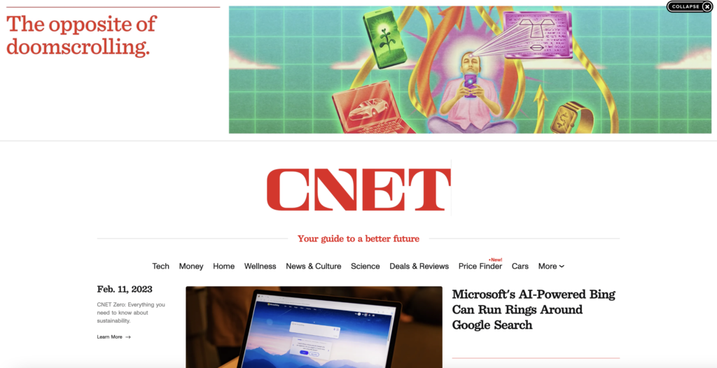
(Updated Feb 11, 2023)
In my original discussion post, I actually had this as my Unappealing site example. CNET has since updated their site to be more appealing since this initial post.
Although it’s come a long way in terms of web design and they’ve updated their logo to be interactive (and the about page is great), I will still note that their home page feels a little behind the times for their brand and offerings. It’s not by any means a horrible user experience, but for a tech product news site, I think they could modernize the interface in a more innovative way.
When I made my initial post, the first thing I saw when I engaged with this brand was a very spammy and unattractive ad that took up half of the above-fold area and unfortunately I did not save a screenshot. I remember my poor experience and questioning whether I was on the right site. Today, it appears branded and beautiful, however. I realize it changes each time and understand that is their way to fund their business by offering this real estate slot for advertisers. Since my first visit to the site was off-putting, I would recommend they raise their standards (and maybe they already have) or more closely partner on designs with advertisers to make the ads feel more native to the brand, like the example screenshot from a recent visit to the site. Otherwise, a spammy, random-feeling ad can immediately deplete the user experience.
Their color scheme is clean and their layout is well organized but it feels boring and plain. Technology-focused sites often feature dark backgrounds with neon and engaging interactive elements right in the above fold content to grab attention immediately, and CNET’s logo is a decent start. For their overall layout, I’d like to see a more innovative design that leans toward newer emerging tech trends.
Check out the sites for yourself and let me know what you think in the comments. What are some other examples of sites that you find appealing or unappealing and why?